A (real-life) usability test of the newly established parcel redirecting system.
A tricky task to fulfill.
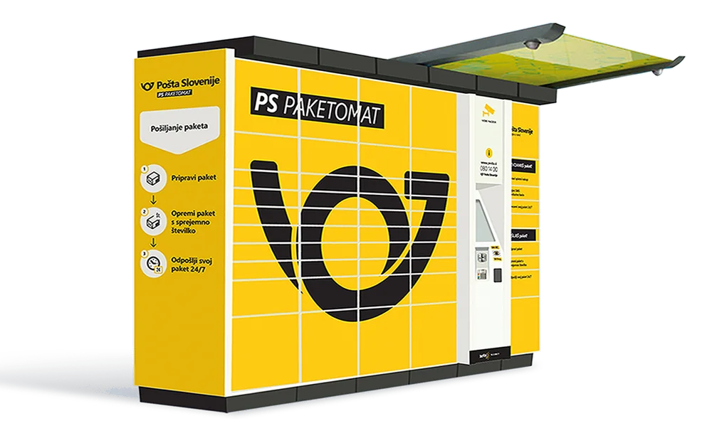
Pošta Slovenije is Slovenia's largest postal service provider. 120+ years of tradition, 500+ physical locations, and 100K+ daily parcel processing load make them a true logistics giant.
Our collaboration started with a bit of a tricky task to fulfill; testing the user experience of receiving a parcel by utilizing their newly established redirecting system. To assure quality data, the tests needed to be conducted in a real-life setting. We happily took on the challenge.
The complexity of a real-life user test.
We picked 15 test subjects, ranging in age and computer literacy, on which we tested 5 different parcel receiving and redirecting scenarios.
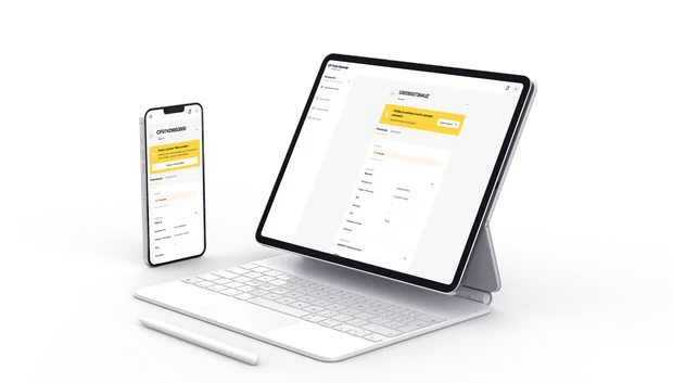
They went through an ordering process, and after a few days received an SMS notifying them of the parcel's arrival. The message (that was dispatched in real life) also contained additional info, telling them that they can, if they wish, redirect it to a different location. By following the link, they landed on an interface where they had to choose a redirecting option (as how they were instructed in the scenario). Then we needed to send out parcels to the locations that they'd picked, one of them also being the freshly-launched parcel locker collection system. After they picked up the parcel, the rather complicated test was done. Analysis followed.
The takeaways included:
- Identifying flaws in SMS copy.
- Benefits of redirecting parcels to a locker were poorly communicated. Consequently, users were not drawn enough to use the new option.
- The costs of some services were not highlighted enough or were shown only later in the process.
- Some UI flaws were identified regarding the difficulty of picking out nearby gas stations and locker locations.
The results.
All of this resulted in a mediocre 65/100 YouX score. Nevertheless, the extractions provided quality insights into how PS can elevate its delivery process to make it more appealing to its vast audience.
Download
Sample Report
you will get


“Overachievers. In addition to the excellent service, we also received a great amount of knowledge and I’m better at my job as a result. It sounds corny, but it’s actually true.”
